How to Navigate the Religious Education Module
The Religious Education program provides a set of user interface controls intended to make it easy to move from one element to another on a given page and to navigate smoothly and reliably to find information on other pages in the program. This topic familiarizes you with the navigation controls and other components of the program's user interface.
In this topic
Navigation Controls and Elements of the User Interface
Showing # - # of # (Total Records Count)
Additional User Interface Components
Default Opening Page: Students & Volunteers
Navigation Controls and Elements of the User Interface
The illustration below identifies the main components of the Religious Education user interface. Click the link in the illustration to jump to the section on this page that describes the element.
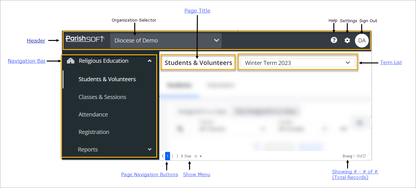
Header
The header is the area at the top of every page in the module. The header contains the following elements:
ParishSOFT LogoParishSOFT Logo
The Religious Education module is a ParishSOFT product. The ParishSOFT company logo appears in the upper-left corner of every page.
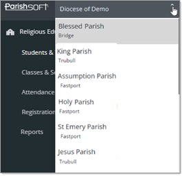
Organization SelectorOrganization Selector
The Organization selector appears at the top of every page. This menu lists every organization you are assigned to and shows the name of the organization you are currently connected to.
To switch organizations, simply, click  to open the menu and select the one you want to work in, as shown below:
Click  and then select Religious Education Help to open the online Help
documentation.
and then select Religious Education Help to open the online Help
documentation.
The Help opens in a separate browser so that you can view information and instructions while working in the application. The Help provides an overview of the concepts and features of the Religious Education application and offers step-by-step instructions on how to perform specific tasks.
 Settings ButtonSettings Button
Click to open the Settings page. On this page, you can activate general Religious Education settings and configure lookups. In addition, you
can configure lookup values for the application's dropdown lists. For more information, go to About the Settings Page.
 Sign Out ButtonSign Out Button
This button shows your username initials or your photo in a circular badge. Click the button to sign out of the module.
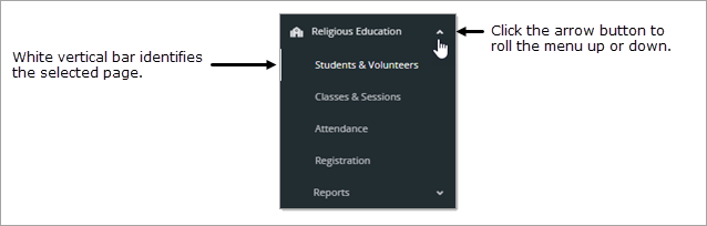
 Navigation Bar
The navigation bar is the vertical menu located on the left side of every page in the application. This menu is available on every page to provide you with easy access to the program's main pages.
To jump to a page, simply select the page link on the menu. A white vertical bar appears to the left of the selected page to indicate it is selected (see illustration below).
If desired, you can roll up the menu on the navigation bar so that the page links are no longer visible. Do do this, click (Up Arrow) at the top of the navigation bar, as shown below:
Page Title
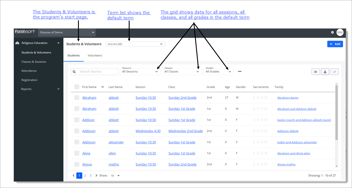
When you select a page link in the navigation bar, the contents of the page are displayed in the right panel. The title of the page you are viewing appears at the top of the page. When you first open the program, you land on the Students & Volunteers page.
Term List
The Term list includes all of the terms created for your organization's Religious Education program. The default term is the one displayed to you when you open the page. When you first use the program, the term you see is the one that was defined as the default (on the Settings page) when the program was set up.
To change the term, simply click  and then select the term you want to work with. The term you select becomes the default term for the page you are working on and for all other pages that have a
Term list (for example, the Classes page
). The selected term remains the default until you change it.
and then select the term you want to work with. The term you select becomes the default term for the page you are working on and for all other pages that have a
Term list (for example, the Classes page
). The selected term remains the default until you change it.
Page Navigation Controls
Page buttons are located at the bottom of several of the program's pages. These buttons let you quickly navigate through a grid consisting of multiple pages.
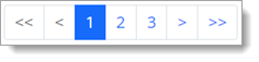
 : click the page number to go directly to the numbered page. For example, clicking 3 takes you to page 3 in the grid.
 : click to go one page back from the page you are currently viewing in the grid.
 : click to go one page forward from the page you are currently viewing in the grid.
 : click to go to the first page in the grid.
 : click to go to the last page in the grid.
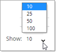
Show Menu
The Show menu appears on several of the program's pages. This menu lets you choose the maximum number of records to display per page in the grid. The default is set to 10.
To change the number or records, click to open the menu. Then, select a value of 25, 50, or 100,
as shown below:
 To speed up page loading, select a lower value.
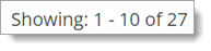
Showing # - # of # (Total Records Count)
The Total Records count appears in the bottom right corner of several pages in the program. This count shows which records in the grid you are currently viewing out of the total number of records across all pages of the grid. Note that the total record count in the view (Showing # - # range) varies depending on the maximum number of records selected for pagination in the Show Menu.
In the illustration below, the Show menu is set to display 10 records per page, so that is the number the system fetches to display in the grid out of a grand total of 27 records in the grid.
Additional User Interface Components
This section describes other user interface components you should be familiar with.
Buttons
A button is a user interface element that performs an action. When clicked, the labeled action (represented by text or an icon) is performed.

 (Email)
Filters
Filters provide a way for you to create specific views of your data. Not all pages have filters, but for those that do, when you first start the program, each page's filters are active and set to All by default.
You can change the default settings as necessary for a page by selecting a new value and then clicking  to confirm your selection.
As a reminder, the system identifies the filters you choose in the area beneath row of filters. As illustrated below, the user filtered the view of the page by applying new values for the Sessions and Classes filters. The area below the filters shows which filters are currently applied.
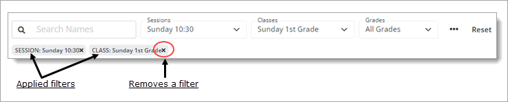
You can remove a filter setting clicking this button to the right of the filter  .
.
Note that after you apply filters, they remain selected for the page until you change them. Even if you navigate to a different page during a session or log out and log back in again, your filter selections for the page remain in effect until you apply
new filters or click  or to remove the current selections.
Tabs
Tabs provide secondary navigation on a given page. The page is subdivided into separate sections and marked with a tab that identifies its content, as illustrated below:
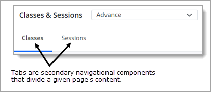
The tabs enable you to quickly navigate between grouped content on a given page. To view a tab's content, simply select the tab. When you put focus on the tab, it is highlighted by means of a blue rectangular block under the name of the selected tab (see previous illustration).
Dropdown Lists
Dropdown lists like the one shown below appear throughout the program. They help you work more efficiently by (depending on their function) enabling you to filter grid content or input data.
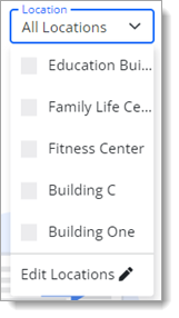
Dropdown lists contain a list of pre-defined options. You can only select one term in the list, which facilitates making choices. The lists contain only valid options so they are useful for preventing data entry errors.
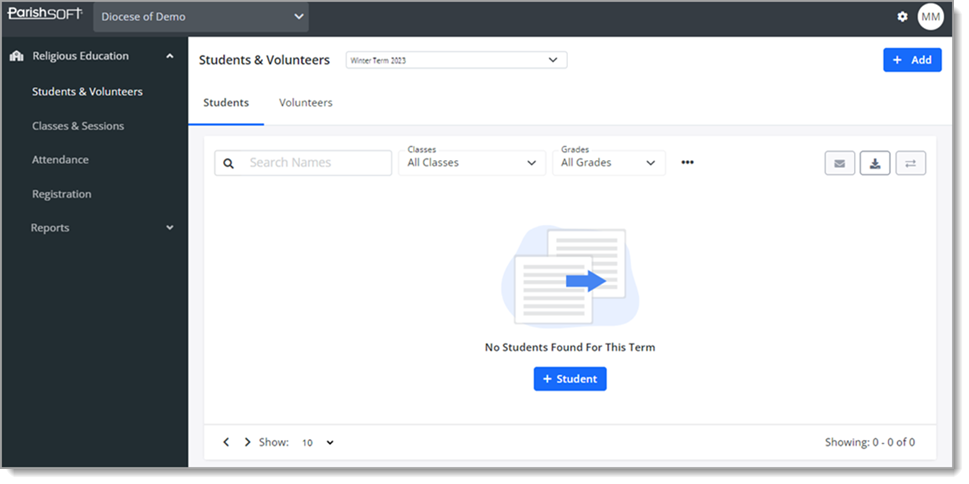
Default Opening Page: Students & Volunteers
By default, when you first open the Religious Education module, the Students & Volunteers page is the first page you see. Because you have no student data, the page displays a "No Students Found For This Term" message, as illustrated below:
After you set up the program by adding terms, creating classes, and adding students and volunteers, the program still opens to the default start page: Students & Volunteers page. Now this page shows data for all sessions, all classes, and all grades in the default term, as illustrated below:
Related Topics